

Cover + Editor’s Letter
For this issue of Voyage Magazine, centered around urban exploration, I aimed to push the boundaries of conventional editorial design while maintaining structure and clarity. The cover features a striking photograph of an urban explorer standing on the edge of a cliff, gazing into the distance—a visual metaphor for the theme of discovery. I framed the image with carefully placed text that includes key articles and standout pages, using a bold typographic treatment of the magazine title to create a strong brand presence.
Hints of blue in the cover image informed the color palette used throughout the spread, including the opening “Letter from the Editor” page. This first page uses a clean, vertical layout that contrasts with the more experimental inner spreads, offering a grounded introduction that guides the reader into the issue. My design process involved building out a flexible grid system that I could break intentionally to create a sense of movement, layering type, and images in a way that mimics the chaotic beauty of urban landscapes.


Center Spread
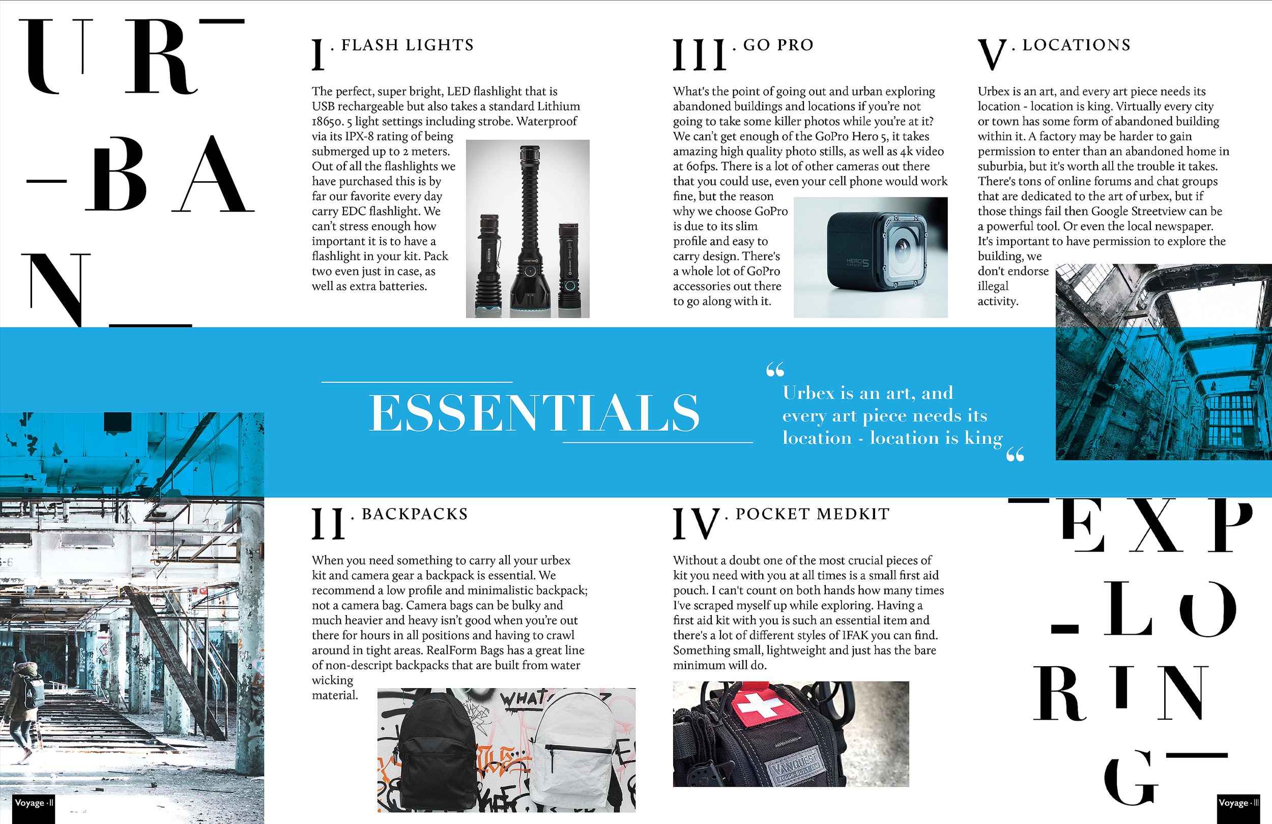
The centerfold spread of Voyage Magazine highlights essential gear for urban exploration, designed to be both informative and visually immersive. While it’s grounded in a structured grid system, I intentionally broke the grid to create tension and movement—mirroring the unpredictable nature of urban exploring itself. I used bold blocks of the same cool-toned blue from the cover to define sections of content and guide the reader’s eye across the spread. Equipment items are arranged in a way that feels almost scattered, yet still deliberate—much like the gear layout an explorer might prepare before a trip.
Each item is paired with concise descriptions and subtle graphic cues to keep the focus on utility without sacrificing visual impact. The final design strikes a balance between editorial clarity and raw visual energy, making the gear feel essential, aspirational, and accessible to readers.
Full-Page Ad

I designed a full-page inner cover ad for Elevation, a premium mountain bike company, to showcase one of their high-performance frames. The goal was to merge sleek, high-end aesthetics with the rugged spirit of the West Coast. I used sharp, angular design elements to echo the geometry of the bike frame itself, while the composition and framing were carefully constructed to draw attention to the frame’s craftsmanship. Natural textures and a cool, earthy palette subtly reinforce the outdoor lifestyle Elevation represents, resulting in a layout that feels both refined and adventurous.